---
title: "Exploring Social Capital"
description: "Exploration of novel Social Connections data to support Lloyds Bank Foundation with their place-based change work"
date: "2025-10-17"
categories: [policy-impact, data-analysis, place-based-change]
echo: false
draft: false
image: "/assets/images/blog/social-connections.png"
code-tools: true
code-summary: "Code For Nerds"
---
{fig-align="center" height=300}
# Exploring Social Capital
::: {.columns}
::: {.column width="50%"}
<div style="text-align: center;">
*Jolyon Miles-Wilson*
</div>
:::
::: {.column width="50%"}
<div style="text-align: center;">
*17-10-2025*
</div>
:::
:::
<!-- end columns -->
We're currently exploring some opportunities to support Lloyds Bank Foundation with their **place-based change** work using novel data on Social Capital, based on data from Facebook.^[[https://data.humdata.org/dataset/uk-social-capital-atlas](https://data.humdata.org/dataset/
uk-social-capital-atlas)] The aim is to understand how social capital can help identify and shape development stategies for areas at a hyperlocal level.
## The Data
The dataset is based on 20.5 million active UK Facebook users with at least 100 friends, aged 25-64, which represents approximately 58% of the 25-64 UK population.^[Harris, T., Iyer, S., Rutter, T., Chi, G., Johnston, D., Lam, P., Makinson, L., Silva, A., Wessel, M., Liou, M.-C., Wang, Y., Zaman, Q., & Bailey, M. (2025). Social Capital in the United Kingdom: Evidence from Six Billion Friendships. OSF. [https://doi.org/10.31235/osf.io/kb7dy_v1](https://doi.org/10.31235/osf.io/kb7dy_v1)] It was produced through a collaboration between Meta, Behavioural Insights Team, the Royal Society of Arts, Stripe Partners, Neighbourly Lab, Opportunity Insights, New York University and Stanford University. During our time at the RSA, both Celestin and I were closely involved in this work.
The data contain many variables measuring different facets of social capital. For now, we focus on just one: **Economic Connectedness**. Economic Connectedness represents the **proportion of friends of people of low socioeconomic status (SES) who are of high SES**. In the seminal work in the US context by Chetty et al. (2022),^[Chetty, R., Jackson, M. O., Kuchler, T., Stroebel, J., Hendren, N., Fluegge, R. B., Gong, S., Gonzalez, F., Grondin, A., Jacob, M., Johnston, D., Koenen, M., Laguna-Muggenburg, E., Mudekereza, F., Rutter, T., Thor, N., Townsend, W., Zhang, R., Bailey, M., … Wernerfelt, N. (2022). Social capital I: Measurement and associations with economic mobility. Nature, 608(7921), 108–121. [https://doi.org/10.1038/s41586-022-04996-4](https://doi.org/10.1038/s41586-022-04996-4)] Economic Connectedness was found to strongly predict upward social mobility.
```{python}
# Packages and config
import pandas as pd
import requests
import re
import geopandas as gpd
from shapely.geometry import Point
import matplotlib.pyplot as plt
import matplotlib as mpl
from mpl_toolkits.axes_grid1.axes_divider import make_axes_locatable
import contextily as cx
import configparser
import janitor
import zipfile
import glob
from sqlalchemy import create_engine
import matplotlib.colors as mcolors
import pickle
import os
import numpy as np
config = configparser.ConfigParser()
config.read(os.path.join('..', 'db_config.ini'))
db_params = dict(config['postgresql'])
# Load config
config = configparser.ConfigParser()
config.read(os.path.join('..', 'db_config.ini'))
db_params = dict(config['postgresql'])
# Build SQLAlchemy connection string
conn_str = (
f"postgresql+psycopg2://{db_params['user']}:{db_params['password']}"
f"@{db_params['host']}:{db_params['port']}/{db_params['database']}"
)
# Create engine
engine = create_engine(conn_str)
```
```{python}
# Updated to appropriate file path
filepath = os.path.join('..', 'assets', 'palettes', 'ice_swatch.txt')
with open(filepath, 'r', encoding='utf-8') as file:
ice_swatch = [line.strip() for line in file if line.strip()]
# Make a colormap
ice_cmap = mcolors.LinearSegmentedColormap.from_list("ice", ice_swatch).reversed()
# Updated to appropriate file path
with open(os.path.join('..', 'assets', 'palettes', 'jk_primary_colours.txt'), 'r') as file:
jk_colours = [line.strip() for line in file]
# Font
hfont = {'fontname': 'Inclusive Sans'}
nfont = {'fontname': 'Open Sans'}
# Set global font family and size
plt.rcParams['font.family'] = 'Open Sans'
plt.rcParams['axes.titlesize'] = 14 # size of the title
plt.rcParams['axes.labelsize'] = 12
mpl.rcParams["figure.facecolor"] = jk_colours[0]
```
```{python}
# Download data if it doesn't exist, otherwise load it
path = os.path.join('data')
if not os.path.exists(path):
os.makedirs(path)
# LAD
file = 'lad_gpd.pkl'
filepath = path + '/' + file
if not os.path.exists(filepath):
with engine.connect() as con:
query = '''
WITH lookup AS (
SELECT DISTINCT ON (lad21cd)
loo.lad21cd, loo.ladnm as lad21nm, foo.rgn21nm_filled as rgn21nm
FROM pcode_census21_lookup loo
LEFT JOIN
lad21_lookup foo
ON loo.lad21cd = foo.lad21cd
)
SELECT lookup.*, geom.geometry
FROM lookup
LEFT JOIN lad21_boundaries geom
ON lookup.lad21cd = geom.lad21cd;
'''
lad_gpd = gpd.read_postgis(query, con, geom_col='geometry')
with open(filepath, 'wb') as file:
pickle.dump(lad_gpd, file)
else:
with open(filepath, 'rb') as file:
lad_gpd = pickle.load(file)
# MSOA
file = 'msoa_gpd.pkl'
filepath = path + '/' + file
if not os.path.exists(filepath):
with engine.connect() as con:
query = '''
WITH lookup AS (
SELECT DISTINCT ON (msoa21cd)
loo.msoa21cd, loo.lad21cd, loo.ladnm as lad21nm, foo.rgn21nm_filled as rgn21nm
FROM pcode_census21_lookup loo
LEFT JOIN
lad21_lookup foo
ON loo.lad21cd = foo.lad21cd
)
SELECT lookup.*, geom.geometry
FROM lookup
LEFT JOIN msoa21_boundaries geom
ON lookup.msoa21cd = geom.msoa21cd;
'''
msoa_gpd = gpd.read_postgis(query, con, geom_col='geometry')
with open(filepath, 'wb') as file:
pickle.dump(msoa_gpd, file)
else:
with open(filepath, 'rb') as file:
msoa_gpd = pickle.load(file)
# MSOA 11
file = 'msoa11_gpd.pkl'
filepath = path + '/' + file
if not os.path.exists(filepath):
with engine.connect() as con:
query = '''
WITH lookup AS (
SELECT DISTINCT ON (msoa11cd)
loo.msoa11cd, loo.lad21cd, loo.lad21nm, foo.rgn21nm_filled as rgn21nm
FROM pcode_census11_lookup loo
LEFT JOIN
lad21_lookup foo
ON loo.lad21cd = foo.lad21cd
)
SELECT lookup.*, geom.geometry
FROM lookup
LEFT JOIN msoa11_boundaries geom
ON lookup.msoa11cd = geom.msoa11cd;
'''
msoa11_gpd = gpd.read_postgis(query, con, geom_col='geometry')
with open(filepath, 'wb') as file:
pickle.dump(msoa11_gpd, file)
else:
with open(filepath, 'rb') as file:
msoa11_gpd = pickle.load(file)
file = 'lookup.pkl'
filepath = path + '/' + file
if not os.path.exists(filepath):
with engine.connect() as con:
query = '''
SELECT DISTINCT ON (msoa21cd)
loo.msoa21cd, loo.lad21cd, loo.ladnm as lad21nm, foo.rgn21nm_filled as rgn21nm
FROM pcode_census21_lookup loo
LEFT JOIN
lad21_lookup foo
ON loo.lad21cd = foo.lad21cd
'''
lookup = pd.read_sql(sql=query, con=con)
with open(filepath, 'wb') as file:
pickle.dump(lookup, file)
else:
with open(filepath, 'rb') as file:
lookup = pickle.load(file)
```
```{python}
#| output: false
#|
# Get the actual published data
### LAD ###
# 1. Specify the url that downloads the data
url = 'https://data.humdata.org/dataset/79d5959f-73b8-4305-bb9e-d829e2e863da/resource/f87c1d44-a56c-48cf-a8bb-1caad97aa589/download/local_authority-20250320t000233z-001.zip'
# 2. Specify folder name as the final part of the url after it's been split on '/' and specify relative path
folder = url.split('/')[-1]
path = os.path.join('data', folder)
# 3. If the path doesn't exist, download the data. If it does exist, skip this step.
if not os.path.exists(path):
req = requests.get(url)
with open(path, 'wb') as output_file:
output_file.write(req.content)
else:
print('Data already downloaded. Loading')
# 4. Unzip the folder
## i. Define outpath as same as in path minus .zip
out_path = os.path.splitext(path)[0] # This removes the .zip extension
## ii. Create the extraction directory if it doesn't exist
if not os.path.exists(out_path):
os.makedirs(out_path)
## iii. Unzip to extraction directory
with zipfile.ZipFile(path, 'r') as zip_ref:
zip_ref.extractall(out_path)
# 5. Identify the file in the directory you want to read and read it
filepath = glob.glob(
os.path.join(out_path, "local_authority", "*_economic_connectedness_[0-9][0-9][0-9][0-9]*.csv")
)
meta_lad = pd.read_csv(filepath[0])
meta_lad = meta_lad.drop(meta_lad.columns[0], axis=1)
# For now let's concentrate only on low_ses_users. But we might
# be interested to look at high_ses_users or the ratio of EC
# between low and high users
# We do this here so that we retain all areas in the subsequent join. We want to ensure
# we have all areas and assign NA to areas not in the Meta data
meta_lad = meta_lad.loc[meta_lad['measurement_category']=='low_ses_users']\
.rename(columns=
{'high_ses_ratio': 'economic_connectedness'}
)
meta_lad = lad_gpd.merge(meta_lad, how='left', left_on='lad21cd', right_on='lad_code').drop(columns='lad_code')
# Make decile variable
meta_lad['ec_decile'] = pd.qcut(meta_lad['economic_connectedness'], q=10, labels=[x for x in range(10,0,-1)], duplicates="drop")
### MSOA ####
# 1. Specify the url that downloads the data
url = 'https://data.humdata.org/dataset/79d5959f-73b8-4305-bb9e-d829e2e863da/resource/b1c4a576-c469-4447-b822-7215a39afcd8/download/msoa-20250320t000309z-001.zip'
# 2. Specify folder name as the final part of the url after it's been split on '/' and specify relative path
folder = url.split('/')[-1]
path = os.path.join('data', folder)
# 3. If the path doesn't exist, download the data. If it does exist, skip this step.
if not os.path.exists(path):
req = requests.get(url)
with open(path, 'wb') as output_file:
output_file.write(req.content)
else:
print('Data already downloaded. Loading')
# 4. Unzip the folder
## i. Define outpath as same as in path minus .zip
out_path = os.path.splitext(path)[0] # This removes the .zip extension
## ii. Create the extraction directory if it doesn't exist
if not os.path.exists(out_path):
os.makedirs(out_path)
## iii. Unzip to extraction directory
with zipfile.ZipFile(path, 'r') as zip_ref:
zip_ref.extractall(out_path)
# 5. Identify the file in the directory you want to read and read it
filepath = glob.glob(
os.path.join(out_path, "msoa", "*_economic_connectedness_[0-9][0-9][0-9][0-9]*.csv")
)
meta_msoa = pd.read_csv(filepath[0])
meta_msoa = meta_msoa.drop(meta_msoa.columns[0], axis=1)
# For now let's concentrate only on low_ses_users. But we might
# be interested to look at high_ses_users or the ratio of EC
# between low and high users
# We do this here so that we retain all areas in the subsequent join. We want to ensure
# we have all areas and assign NA to areas not in the Meta data
meta_msoa = meta_msoa.loc[meta_msoa['measurement_category']=='low_ses_users']\
.rename(columns=
{'high_ses_ratio': 'economic_connectedness'}
)
meta_msoa = msoa_gpd.merge(meta_msoa, how='left', left_on='msoa21cd', right_on='zip_prediction').drop(columns='zip_prediction')
# Make decile variable
meta_msoa['ec_decile'] = pd.qcut(meta_msoa['economic_connectedness'], q=10, labels=[x for x in range(10,0,-1)], duplicates="drop")
```
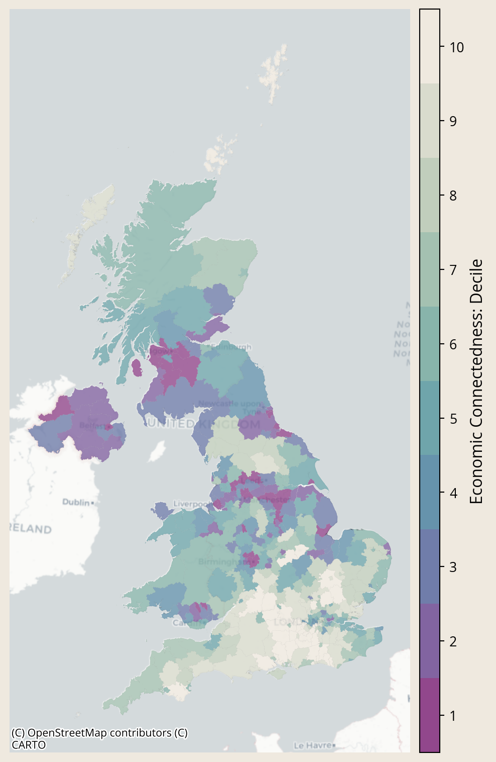
## The National View
Social capital is stronger in the UK than it is in the US. But it is qualitatively different; in the UK it is driven by hobby groups, whereas in the US it is driven by religious groups.
While the overall picture is strong, social capital varies across England and Wales.
```{python}
#| fig-align: center
# variable = 'economic_connectedness'
variable = 'ec_decile'
variable_clean = variable.title().replace('_',' ')
fig, ax = plt.subplots(1,1, figsize = [15,10])
meta_lad.plot(
ax = ax,
column = variable,
cmap=ice_cmap,
alpha=0.8,
legend=False,
edgecolor='black',
linewidth=0.01,
missing_kwds={
"color": "lightgrey", # fill color for NA
"edgecolor": "black", # optional outline for NA polygons
"hatch": "///", # optional hatch for NA areas
"label": "Missing" # adds entry to legend if legend=True
}
)
# Create discrete colormap
colors = [ice_cmap(i/9) for i in range(10)] # sample 10 discrete colors - using i/9 ensures last colour is used
cmap_discrete = mpl.colors.ListedColormap(colors)
# Use a simple normalize from 1 to 10
norm = mpl.colors.Normalize(vmin=1, vmax=11)
sm = mpl.cm.ScalarMappable(cmap=cmap_discrete, norm=norm)
sm._A = []
divider = make_axes_locatable(ax)
cax = divider.append_axes("right", size="5%", pad=0.1)
# Create colorbar
cbar = fig.colorbar(sm, cax=cax)
# Set custom ticks at bin centers
tick_positions = [i + 0.5 for i in range(1, 11)] # 1.5, 2.5, ..., 9.5
cbar.set_ticks(tick_positions)
cbar.set_ticklabels(range(1, 11)) # label them 1–10
cbar.set_label('Economic Connectedness: Decile', fontsize=12)
cx.add_basemap(ax, crs=meta_lad.crs, source=cx.providers.CartoDB.Positron)
# ax.set_title(f"{variable_clean}: England and Wales", fontsize=14, **hfont)
ax.set_axis_off();
```
<!-- Start regions -->
```{python}
lads = ['Great Yarmouth','Redcar and Cleveland','Telford and Wrekin']
areas_of_interest = lookup.loc[lookup['lad21nm'].isin(lads),['lad21nm','rgn21nm']].drop_duplicates().reset_index(drop=True)
```
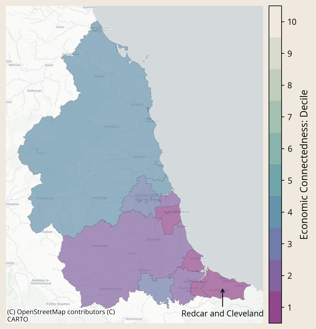
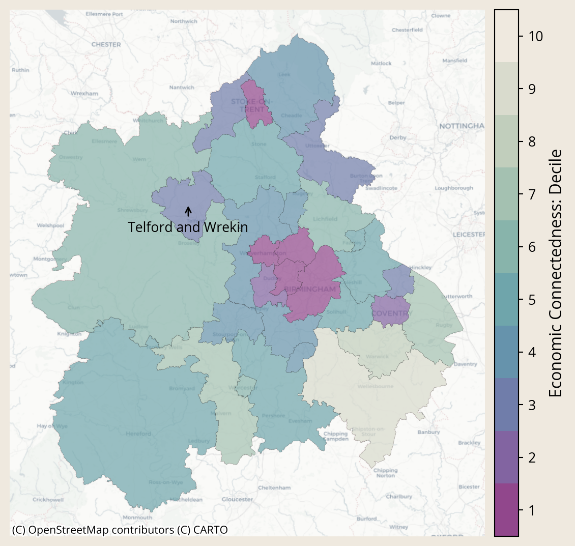
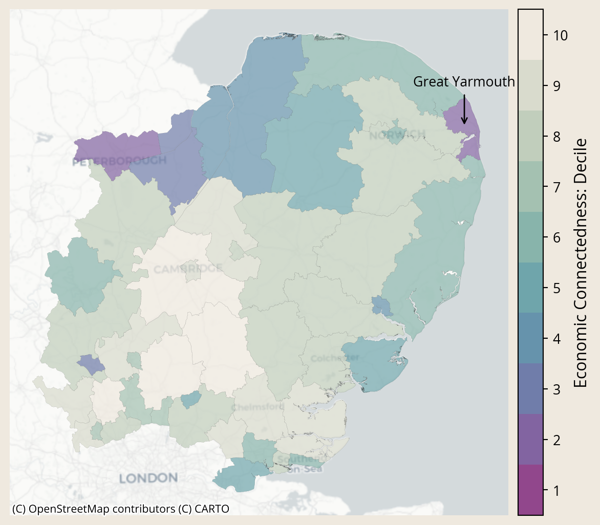
## The Regional Picture {.smaller}
Social Capital varies from place to place, which may make it a particularly useful metric for judging the strengths and needs of local areas. Below, we can see how social capital varies between and within regions.^[We focus here only on this handful of areas because these are the places where some of Lloyds Bank Foundation's work is already focused. The same exercise can be done for any place in the UK]
::: {.panel-tabset}
```{python}
area_of_interest = areas_of_interest.iloc[0,0]
region_of_interest = areas_of_interest.iloc[0,1]
```
### `{python} region_of_interest`
This map shows Economic Connectedness by **Local Authority District** for the **`{python} region_of_interest`**.
Purple values indicate lower Economic Connectedness.
Whiter values indicate higher Economic Connectedness.
```{python}
variable = 'ec_decile'
variable_clean = variable.title().replace('_',' ')
meta_subset = meta_lad.loc[meta_lad['rgn21nm'].str.contains(region_of_interest, na=False)]
fig, ax = plt.subplots(1,1, figsize = [7,7])
meta_subset.plot(
ax = ax,
column = variable,
cmap=ice_cmap,
alpha=0.7,
legend=False,
edgecolor='black',
linewidth=0.1,
missing_kwds={
"color": "lightgrey", # fill color for NA
"edgecolor": "black", # optional outline for NA polygons
"hatch": "///", # optional hatch for NA areas
"label": "Missing" # adds entry to legend if legend=True
})
# Scale the legend bar
divider = make_axes_locatable(ax)
cax = divider.append_axes("right", size="5%", pad=0.1)
# Create discrete colormap
colors = [ice_cmap(i/9) for i in range(10)] # sample 10 discrete colors - using i/9 ensures last colour is used
cmap_discrete = mpl.colors.ListedColormap(colors)
# Use a simple normalize from 1 to 10
norm = mpl.colors.Normalize(vmin=1, vmax=11)
sm = mpl.cm.ScalarMappable(cmap=cmap_discrete, norm=norm)
sm._A = []
# Create colorbar
cbar = fig.colorbar(sm, cax=cax)
# Set custom ticks at bin centers
tick_positions = [i + 0.5 for i in range(1, 11)] # 1.5, 2.5, ..., 9.5
cbar.set_ticks(tick_positions)
cbar.set_ticklabels(range(1, 11)) # label them 1–10
cbar.set_label('Economic Connectedness: Decile', fontsize=12)
aoi = meta_subset.loc[meta_subset['lad21nm']==area_of_interest]
xy = np.array([aoi.centroid.x.values[0], aoi.centroid.y.values[0]])
nudge = [1, .97]
xy_nudged= xy * nudge
# xy = aoi.centroid
ax.annotate(area_of_interest, xy=xy, xytext=xy_nudged, arrowprops=dict(arrowstyle="->"), ha='center')
cx.add_basemap(ax, crs=meta_subset.crs, source=cx.providers.CartoDB.Positron)
ax.set_axis_off();
# ax.set_title(f"{variable_clean}: {region_of_interest}", fontsize=14);
```
```{python}
area_of_interest = areas_of_interest.iloc[1,0]
region_of_interest = areas_of_interest.iloc[1,1]
```
### `{python} region_of_interest`
This map shows Economic Connectedness by **Local Authority District** for the **`{python} region_of_interest`**.
Purple values indicate lower Economic Connectedness.
Whiter values indicate higher Economic Connectedness.
```{python}
variable = 'ec_decile'
variable_clean = variable.title().replace('_',' ')
meta_subset = meta_lad.loc[meta_lad['rgn21nm'].str.contains(region_of_interest, na=False)]
fig, ax = plt.subplots(1,1, figsize = [7,7])
meta_subset.plot(
ax = ax,
column = variable,
cmap=ice_cmap,
alpha=0.7,
legend=False,
edgecolor='black',
linewidth=0.1,
missing_kwds={
"color": "lightgrey", # fill color for NA
"edgecolor": "black", # optional outline for NA polygons
"hatch": "///", # optional hatch for NA areas
"label": "Missing" # adds entry to legend if legend=True
})
# Scale the legend bar
divider = make_axes_locatable(ax)
cax = divider.append_axes("right", size="5%", pad=0.1)
# Create discrete colormap
colors = [ice_cmap(i/9) for i in range(10)] # sample 10 discrete colors - using i/9 ensures last colour is used
cmap_discrete = mpl.colors.ListedColormap(colors)
# Use a simple normalize from 1 to 10
norm = mpl.colors.Normalize(vmin=1, vmax=11)
sm = mpl.cm.ScalarMappable(cmap=cmap_discrete, norm=norm)
sm._A = []
# Create colorbar
cbar = fig.colorbar(sm, cax=cax)
# Set custom ticks at bin centers
tick_positions = [i + 0.5 for i in range(1, 11)] # 1.5, 2.5, ..., 9.5
cbar.set_ticks(tick_positions)
cbar.set_ticklabels(range(1, 11)) # label them 1–10
cbar.set_label('Economic Connectedness: Decile', fontsize=12)
aoi = meta_subset.loc[meta_subset['lad21nm']==area_of_interest]
xy = np.array([aoi.centroid.x.values[0], aoi.centroid.y.values[0]])
nudge = [1, .97]
xy_nudged= xy * nudge
# xy = aoi.centroid
ax.annotate(area_of_interest, xy=xy, xytext=xy_nudged, arrowprops=dict(arrowstyle="->"), ha='center')
cx.add_basemap(ax, crs=meta_subset.crs, source=cx.providers.CartoDB.Positron)
ax.set_axis_off();
# ax.set_title(f"{variable_clean}: {region_of_interest}", fontsize=14);
```
```{python}
area_of_interest = areas_of_interest.iloc[2,0]
region_of_interest = areas_of_interest.iloc[2,1]
```
### `{python} region_of_interest`
This map shows Economic Connectedness by **Local Authority District** for the **`{python} region_of_interest`**.
Purple values indicate lower Economic Connectedness.
Whiter values indicate higher Economic Connectedness.
```{python}
variable = 'ec_decile'
variable_clean = variable.title().replace('_',' ')
meta_subset = meta_lad.loc[meta_lad['rgn21nm'].str.contains(region_of_interest, na=False)]
fig, ax = plt.subplots(1,1, figsize = [7,7])
meta_subset.plot(
ax = ax,
column = variable,
cmap=ice_cmap,
alpha=0.7,
legend=False,
edgecolor='black',
linewidth=0.04,
missing_kwds={
"color": "lightgrey", # fill color for NA
"edgecolor": "black", # optional outline for NA polygons
"hatch": "///", # optional hatch for NA areas
"label": "Missing" # adds entry to legend if legend=True
})
# Scale the legend bar
divider = make_axes_locatable(ax)
cax = divider.append_axes("right", size="5%", pad=0.1)
# Create discrete colormap
colors = [ice_cmap(i/9) for i in range(10)] # sample 10 discrete colors - using i/9 ensures last colour is used
cmap_discrete = mpl.colors.ListedColormap(colors)
# Use a simple normalize from 1 to 10
norm = mpl.colors.Normalize(vmin=1, vmax=11)
sm = mpl.cm.ScalarMappable(cmap=cmap_discrete, norm=norm)
sm._A = []
# Create colorbar
cbar = fig.colorbar(sm, cax=cax)
# Set custom ticks at bin centers
tick_positions = [i + 0.5 for i in range(1, 11)] # 1.5, 2.5, ..., 9.5
cbar.set_ticks(tick_positions)
cbar.set_ticklabels(range(1, 11)) # label them 1–10
cbar.set_label('Economic Connectedness: Decile', fontsize=12)
aoi = meta_subset.loc[meta_subset['lad21nm']==area_of_interest]
xy = np.array([aoi.centroid.x.values[0], aoi.centroid.y.values[0]])
nudge = [1, 1.05]
xy_nudged= xy * nudge
# xy = aoi.centroid
ax.annotate(area_of_interest, xy=xy, xytext=xy_nudged, arrowprops=dict(arrowstyle="->"), ha='center')
cx.add_basemap(ax, crs=meta_subset.crs, source=cx.providers.CartoDB.Positron)
ax.set_axis_off();
# ax.set_title(f"{variable_clean}: {region_of_interest}", fontsize=14);
```
:::
<!-- End tabset -->
<!-- Start LADs -->
## Social Capital is Hyper-local {.smaller}
Zooming in even further highlights that social capital can be hyperlocal. Below, we visualise small areas within local authorities to show how social connections vary from neighbourhood to neighbourhood.
::: {.panel-tabset}
```{python}
area_of_interest = areas_of_interest.iloc[0,0]
region_of_interest = areas_of_interest.iloc[0,1]
```
### `{python} area_of_interest`
This map shows Economic Connectedness by **Middle layer Super Output Area** for **`{python} area_of_interest`**.
Purple values indicate lower Economic Connectedness.
Whiter values indicate higher Economic Connectedness.
```{python}
variable = 'ec_decile'
variable_clean = variable.title().replace('_',' ')
# meta_subset = meta_msoa.loc[meta_msoa['lad21nm'].str.contains(area_of_interest)]
meta_subset = meta_msoa.loc[meta_msoa['lad21nm'] == area_of_interest]
fig, ax = plt.subplots(1,1, figsize = [7,7])
meta_subset.plot(
ax = ax,
column = variable,
cmap=ice_cmap,
alpha=0.7,
legend=False,
edgecolor='black',
linewidth=0.2,
missing_kwds={
"color": "lightgrey", # fill color for NA
"edgecolor": "black", # optional outline for NA polygons
"hatch": "///", # optional hatch for NA areas
"label": "Missing" # adds entry to legend if legend=True
})
# Scale the legend bar
divider = make_axes_locatable(ax)
cax = divider.append_axes("right", size="5%", pad=0.1)
# Create discrete colormap
colors = [ice_cmap(i/9) for i in range(10)] # sample 10 discrete colors - using i/9 ensures last colour is used
cmap_discrete = mpl.colors.ListedColormap(colors)
# Use a simple normalize from 1 to 10
norm = mpl.colors.Normalize(vmin=1, vmax=11)
sm = mpl.cm.ScalarMappable(cmap=cmap_discrete, norm=norm)
sm._A = []
# Create colorbar
cbar = fig.colorbar(sm, cax=cax)
# Set custom ticks at bin centers
tick_positions = [i + 0.5 for i in range(1, 11)] # 1.5, 2.5, ..., 9.5
cbar.set_ticks(tick_positions)
cbar.set_ticklabels(range(1, 11)) # label them 1–10
cbar.set_label('Economic Connectedness: Decile', fontsize=12)
cx.add_basemap(ax, crs=meta_subset.crs, source=cx.providers.CartoDB.Positron)
ax.set_axis_off();
# ax.set_title(f"{variable_clean}: {area_of_interest}", fontsize=14);
```
```{python}
area_of_interest = areas_of_interest.iloc[1,0]
region_of_interest = areas_of_interest.iloc[1,1]
```
### `{python} area_of_interest`
This map shows Economic Connectedness by **Middle layer Super Output Area** for **`{python} area_of_interest`**.
Purple values indicate lower Economic Connectedness.
Whiter values indicate higher Economic Connectedness.
```{python}
variable = 'ec_decile'
variable_clean = variable.title().replace('_',' ')
# meta_subset = meta_msoa.loc[meta_msoa['lad21nm'].str.contains(area_of_interest)]
meta_subset = meta_msoa.loc[meta_msoa['lad21nm'] == area_of_interest]
fig, ax = plt.subplots(1,1, figsize = [7,7])
meta_subset.plot(
ax = ax,
column = variable,
cmap=ice_cmap,
alpha=0.7,
legend=False,
edgecolor='black',
linewidth=0.2,
missing_kwds={
"color": "lightgrey", # fill color for NA
"edgecolor": "black", # optional outline for NA polygons
"hatch": "///", # optional hatch for NA areas
"label": "Missing" # adds entry to legend if legend=True
})
# Scale the legend bar
divider = make_axes_locatable(ax)
cax = divider.append_axes("right", size="5%", pad=0.1)
# Create discrete colormap
colors = [ice_cmap(i/9) for i in range(10)] # sample 10 discrete colors - using i/9 ensures last colour is used
cmap_discrete = mpl.colors.ListedColormap(colors)
# Use a simple normalize from 1 to 10
norm = mpl.colors.Normalize(vmin=1, vmax=11)
sm = mpl.cm.ScalarMappable(cmap=cmap_discrete, norm=norm)
sm._A = []
# Create colorbar
cbar = fig.colorbar(sm, cax=cax)
# Set custom ticks at bin centers
tick_positions = [i + 0.5 for i in range(1, 11)] # 1.5, 2.5, ..., 9.5
cbar.set_ticks(tick_positions)
cbar.set_ticklabels(range(1, 11)) # label them 1–10
cbar.set_label('Economic Connectedness: Decile', fontsize=12)
cx.add_basemap(ax, crs=meta_subset.crs, source=cx.providers.CartoDB.Positron)
ax.set_axis_off();
# ax.set_title(f"{variable_clean}: {area_of_interest}", fontsize=14);
```
```{python}
area_of_interest = areas_of_interest.iloc[2,0]
region_of_interest = areas_of_interest.iloc[2,1]
```
### `{python} area_of_interest`
This map shows Economic Connectedness by **Middle layer Super Output Area** for **`{python} area_of_interest`**.
Purple values indicate lower Economic Connectedness.
Whiter values indicate higher Economic Connectedness.
```{python}
variable = 'ec_decile'
variable_clean = variable.title().replace('_',' ')
# meta_subset = meta_msoa.loc[meta_msoa['lad21nm'].str.contains(area_of_interest)]
meta_subset = meta_msoa.loc[meta_msoa['lad21nm'] == area_of_interest]
fig, ax = plt.subplots(1,1, figsize = [7,7])
meta_subset.plot(
ax = ax,
column = variable,
cmap=ice_cmap,
alpha=0.7,
legend=False,
edgecolor='black',
linewidth=0.2,
missing_kwds={
"color": "lightgrey", # fill color for NA
"edgecolor": "black", # optional outline for NA polygons
"hatch": "///", # optional hatch for NA areas
"label": "Missing" # adds entry to legend if legend=True
})
# Scale the legend bar
divider = make_axes_locatable(ax)
cax = divider.append_axes("right", size="5%", pad=0.1)
# Create discrete colormap
colors = [ice_cmap(i/9) for i in range(10)] # sample 10 discrete colors - using i/9 ensures last colour is used
cmap_discrete = mpl.colors.ListedColormap(colors)
# Use a simple normalize from 1 to 10
norm = mpl.colors.Normalize(vmin=1, vmax=11)
sm = mpl.cm.ScalarMappable(cmap=cmap_discrete, norm=norm)
sm._A = []
# Create colorbar
cbar = fig.colorbar(sm, cax=cax)
# Set custom ticks at bin centers
tick_positions = [i + 0.5 for i in range(1, 11)] # 1.5, 2.5, ..., 9.5
cbar.set_ticks(tick_positions)
cbar.set_ticklabels(range(1, 11)) # label them 1–10
cbar.set_label('Economic Connectedness: Decile', fontsize=12)
cx.add_basemap(ax, crs=meta_subset.crs, source=cx.providers.CartoDB.Positron)
ax.set_axis_off();
# ax.set_title(f"{variable_clean}: {area_of_interest}", fontsize=14);
```
:::
<!-- End tabset -->
## The Work continues
We aim to further explore how these novel data on social capital can be put to use to help improve social outcomes. Stay tuned by subscribing to our newsletter below to hear about our progress.

Social Capital is Hyper-local
Zooming in even further highlights that social capital can be hyperlocal. Below, we visualise small areas within local authorities to show how social connections vary from neighbourhood to neighbourhood.
This map shows Economic Connectedness by Middle layer Super Output Area for Redcar and Cleveland.
Purple values indicate lower Economic Connectedness.
Whiter values indicate higher Economic Connectedness.
This map shows Economic Connectedness by Middle layer Super Output Area for Telford and Wrekin.
Purple values indicate lower Economic Connectedness.
Whiter values indicate higher Economic Connectedness.
This map shows Economic Connectedness by Middle layer Super Output Area for Great Yarmouth.
Purple values indicate lower Economic Connectedness.
Whiter values indicate higher Economic Connectedness.